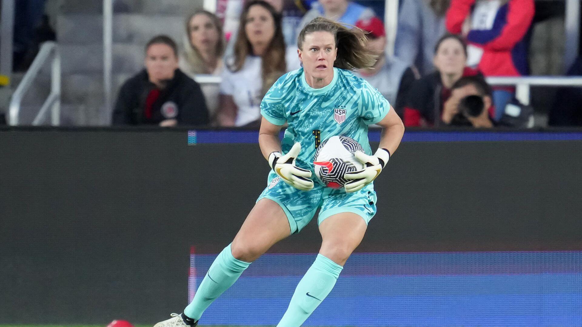
Top USWNT Jerseys from the Last Decade
The U.S. Women’s National Team has seen some hits and misses when it comes to jersey designs. Of course, the USWNT has two kits for each season, away and home, but for the sake of time we’ll just be taking on the more well known design from that year. In honor of 4th of July and everything Red, White, and Blue, here is the definitive ranking of the 11 worst to best official USWNT kits from the last decade.
#11: 2013 Jerseys
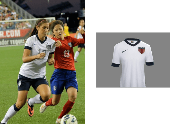
There isn’t really anything special about this jersey. Except for the crest, it looks like something anyone could pick up at a department store. It’s lack of style and uniqueness puts it solidly at number 11, our worst jersey of the past decade.
#10: 2010 Jerseys
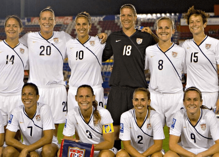
The 2010 kits fall solidly at number 10. Another lackluster jersey design, but more interesting than 2013. The diagonal stripe looks a lot like a seatbelt or a pageant sash. Maybe if 2010 were a more remarkable year for the team this could have been symbolic for the titles they’d won.
#9: 2012 Jerseys
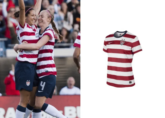
This could be the most infamous jersey design in U.S. soccer history—and not for any stylish reasons. The 2012 kits has been dubbed the “Where is Waldo” uniform, for blindingly obvious reasons. The only reason this one ranks higher than any others is because it at least got people’s attention.
#8: 2017 Jerseys
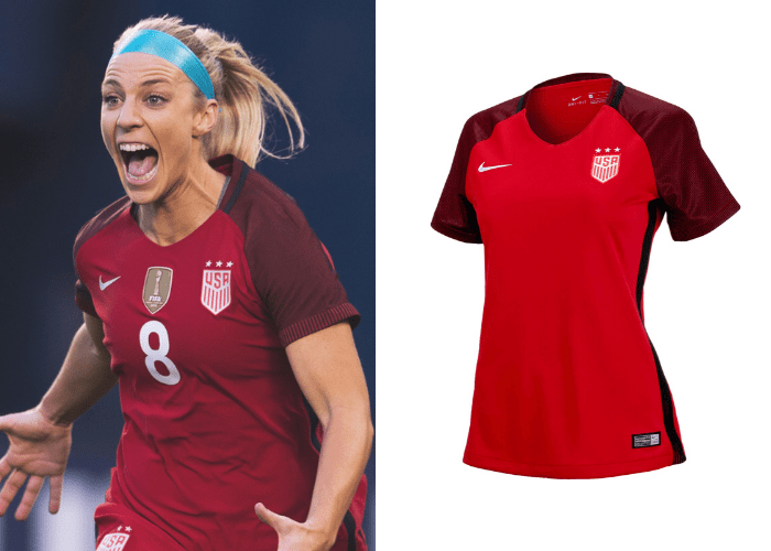
This jersey is a bit more lively than the ones that came before. The shades of red and the black piping along the side give it a little bit more of an edge – putting it firmly at number eight. It’s a sleek look that shook things up a little.
#7: 2011 Jerseys
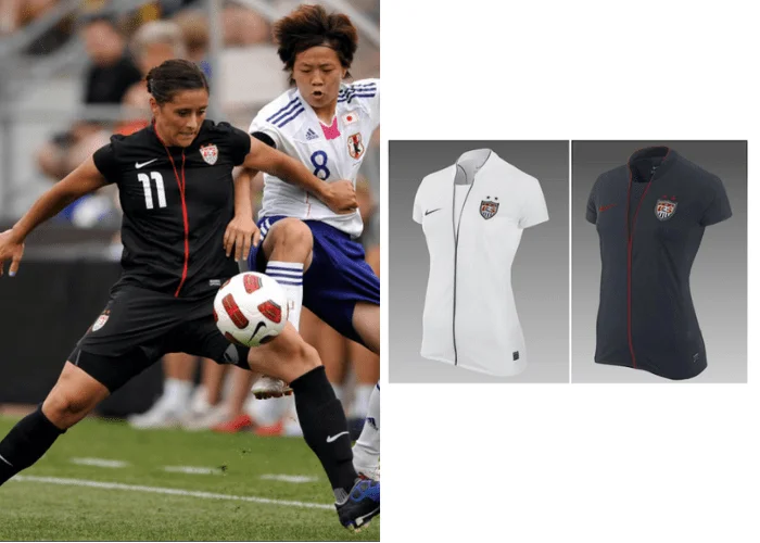
This one would have been lower on the list if not for the front seams. Yes, it’s a plain design, but the neckline and the detail on the front turn it into something much more interesting than the standard jersey design. However, the kit also got its’ fair share of criticism as the ladies prepared for the 2011 World Cup, with the all-black version being dubbed the “black widow.”
#6: 2019 Jerseys
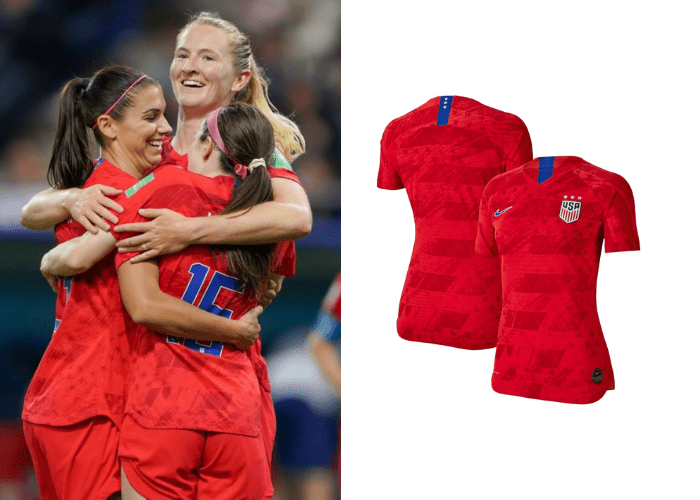
This jersey could have been yet another plain jersey, but the details really make it. The subtle and slightly distressed looking stars and stripes design sets it off and makes it a lot more interesting to look at than it would have been with a more solid pattern. Plus, this is the jersey our USWNT ladies wore when they earned their fourth World Cup championship and another star for future jerseys.
#5: 2016 Jerseys
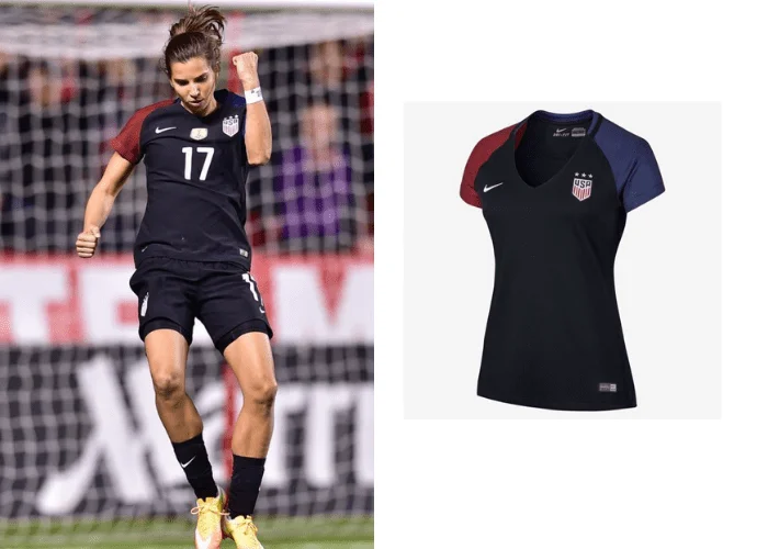
Most of the uniforms on this list up until 2016 have been, well, uniform. But this kit uses color blocking on the sleeves to create a more interesting look. Something about this simple but clean jersey is just so chic in a way that most of the other kits from the last decade haven’t been.
#4: 2020 Jerseys
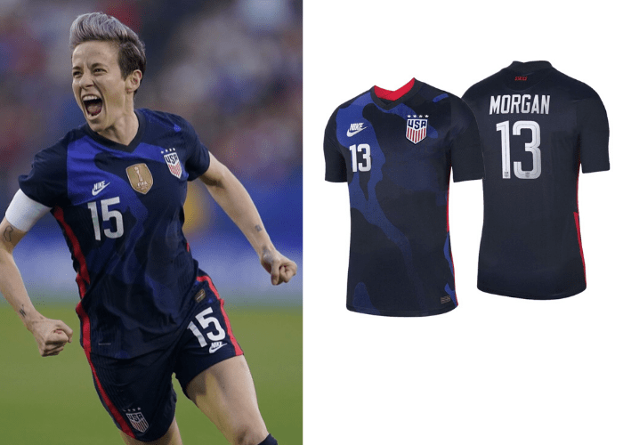
Although we might not get to see these uniforms in any more action this year, they’re a great look. Several shades of blue create an abstract almost camo kind of design to the front with a few little red accents here and there.
#3: 2018 Jerseys
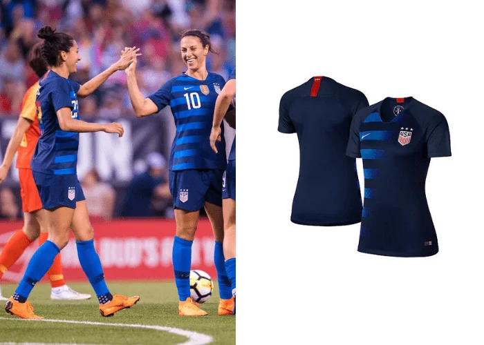
A gradient is always a good look, making these jerseys a bit more interesting and worthy of the top three. Both home and away jerseys have the gradient, one fading from blue, the other creating a red, white, and blue fade effect.
#2: 2015 Jerseys
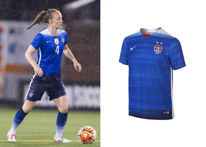
The 2015 kit features a graphic line pattern of alternating blues that eventually goes from white to navy blue. Something about it feels a lot like the ocean. It’s a fun design that also still has the look of a team that means business.
#1: 2014 Jerseys
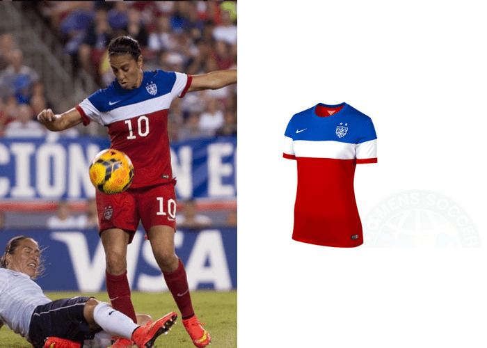
At the top of this list is the jersey that has something for everyone. 2014 was simple without being plain; this kit is just a lot of fun, it looks like summertime with a bomb-pop in each hand. The colors are vibrant and stand out on the field. This is also the year that the U.S. soccer teams donned those collared kits (ewww), but we would rather focus on this bright get up.
Whether they’re in all white, looking like a popsicle, or a classic hard to find character, one thing is for sure, the USWNT ladies shine no matter what they’re wearing.
—
GIRLS SOCCER NETWORK: YOUR SOURCE FOR GIRLS SOCCER NEWS


