Home » Blog » Uncategorized » Ranking the 14 New NWSL Kits From Hot to Not
Ranking the 14 New NWSL Kits From Hot to Not
Another year, another exciting kit drop for the NWSL as it celebrates its 12th year in commission. The league and all 14 teams have done an amazing job at building up the hype for this release. We’ve decided to rank all the teams’ kits based on the look and meaning behind each kit. These rankings are based upon the consideration of both kits, not just one. Here’s our list ranking the 2024 NWSL kits.
1. Racing Louisville
Year after year, Racing Louisville does not miss when it comes to their jerseys. The argyle mint green with the lavender diamond pattern is a tribute to the horseracing culture in Louisville and also looks incredible. The second jersey is clean and simple, with dark purple.
2. Seattle Reign
The switch from the OL Reign back to the Seattle Reign is a welcome sight. Not only is the revamped logo one of the best in the league, but the new color scheme on the alternate jersey is a stunner. The dark blue accented with gold, including gold socks and shorts, is going to be one of the best-looking jerseys in the league to go with the classic white kits they already have. Paying homage to their original kits from 2013 was the right choice in every way.
3. Bay FC
From a fashion perspective, Bay FC has gotten off to a great start. You may have already seen the Bay FC letterman jackets they’ve created, which are pure heat. Now, in their first year, they did a great job of keeping it simple with solid colors—no extra patterns, stripes, or anything to take away from the solid colors. You can never go wrong with simple and clean colors that go together.
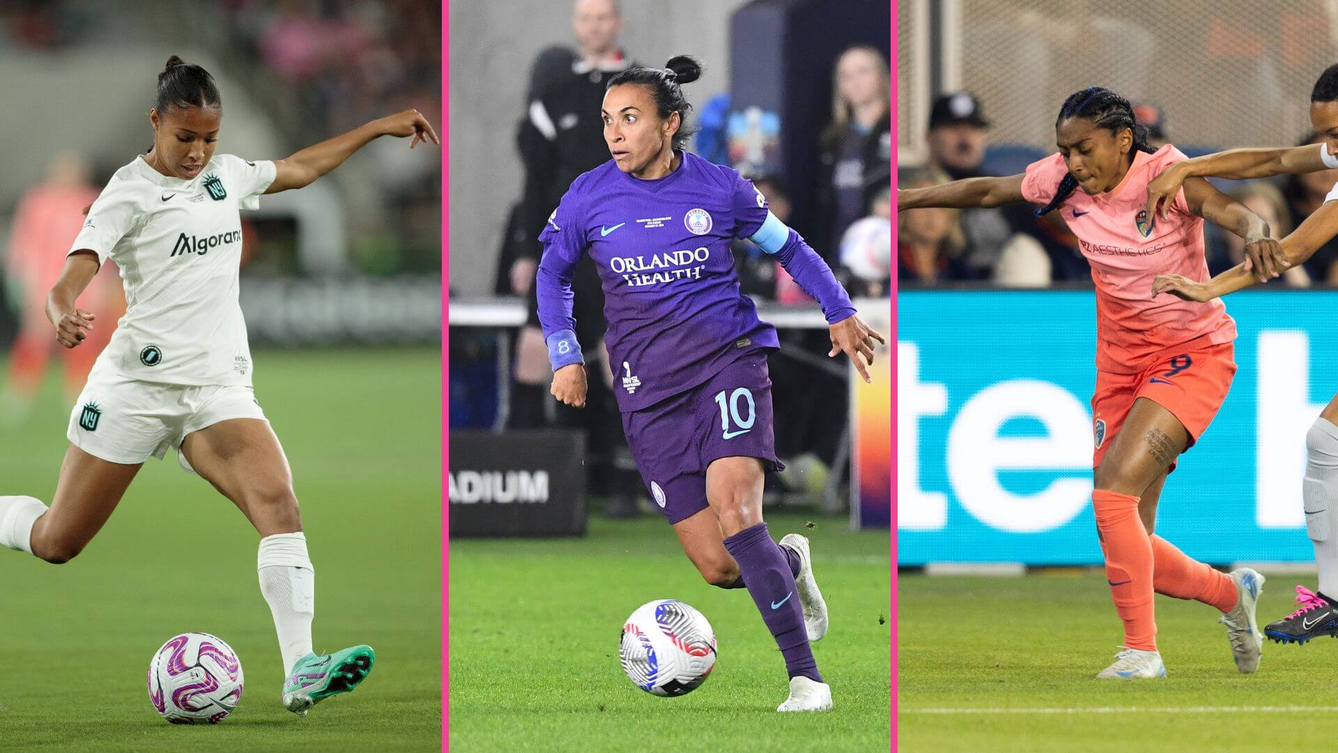
4. Orlando Pride
The Pride’s purple kits are a league staple, and it’s great to see the team choose not to deviate from that in any way. Plus, the alternate jersey is citrus-themed to highlight the orange industry in Florida. It’s something brand new we haven’t seen before from Pride, and while orange is usually a no-no, the bright colors with the light green works and make it pop.
5. Houston Dash
Houston hasn’t deviated too much from the solid orange until now, and it’s a great look. The Dash pays tribute to the stars of Houston with its history of space exploration and honors some of the local clubs. The light blue, as an alternative to the orange, is a great fit and pairs the two colors together nicely.
6. Utah Royals
The Utah Royals are back in the NWSL, and it’s with a bang. They chose to keep their colors the same, and the primary yellow kit is called “The Ascent,” which speaks to the beautiful mountain ranges all across Utah.
7. Gotham FC
The defending champs come in right in the middle of the list. The light blue alternate jersey is great, and the primary kit highlights the NYC skyline with the Hudson River running through it. It looks great. I don’t put it higher because the design and placement of the sponsor logo also matter, and the extra bold Carmax takes away from the rest of the kit for me.
8. Angel City
Angel City always goes above and beyond when creating a theme for their jerseys, and this year, they went with a moonlight and sunrise theme, which is an amazing idea. The sunrise jersey in all pink should be a bestseller, but the moonlight black kit with the pattern looks a little too busy compared to the solid black kits they’ve done in the past. Otherwise, this would be higher on the list.
9. San Diego Wave
The Wave finally deviated from their dark blue kits with some mixed results. The all-pink jersey looks fantastic and should be a popular jersey. The alternate jersey is meant to be a San Diego sunset, which is a great idea, but the execution doesn’t match. The colors are nice, but the pattern leaves much to be desired, in my opinion.
10. Kansas City Current
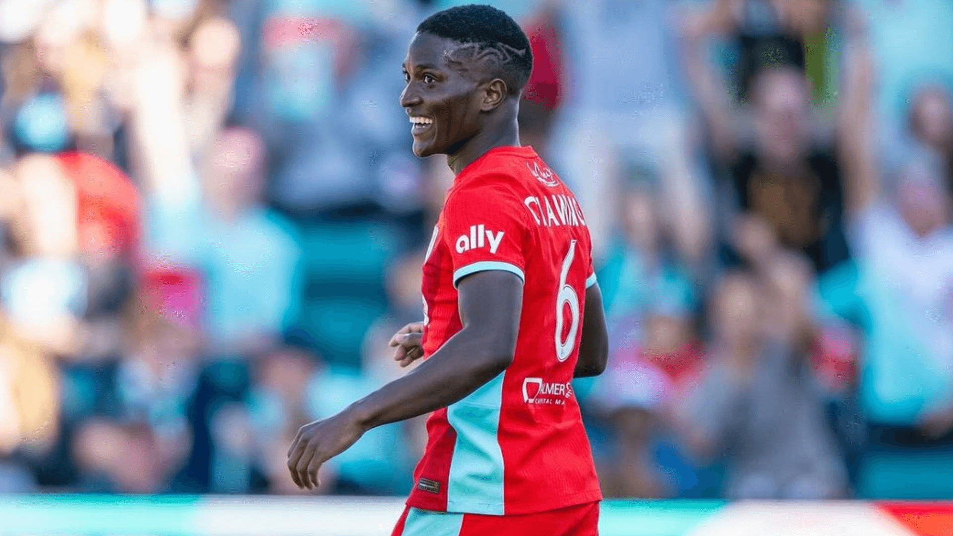
Kansas City’s jerseys are meant to honor their new stadium, which looks great. The teal accent on the red and white jerseys works well. It’s a slightly upgraded version of last year’s kits; nothing crazy here.
11. Chicago Red Stars
Chicago has always done a great job of incorporating the city in some way, shape, or form within its jerseys. The solid, darker-colored jersey is something different and might be a nice change of pace. The primary blue kit seems like a lighter blue than usual, and while the patterns honor the people of the city, they’re hard to appreciate unless you get a closer look at them.
12. North Carolina Courage
This is the second year running where the Courage have underwhelmed with their release. The light pink jersey looks fantastic. While the alternate kit is for the triangle region of North Carolina, literally putting a triangle and arrows on the kit doesn’t work.
13. Portland Thorns
I’m actually stunned at these jerseys from the Thorns. Not sure if the new owners had a say in revamping the Thorns color scheme and design but that red is way too bright for Portland and doesn’t fit with the vibes of the city at all. Last year’s rose kit with the thorns was way better. The dark kit is more of a fit, but this is just so different from the usual black and red kits they’ve had in the past. If it ain’t broke, don’t fix it. I want the black and red jerseys back now.
14. Washington Spirit
This is going to look like I’m hating on the Spirit on purpose because this is the second year running I’ve ranked them towards the bottom. I really like the yellow kit. It’s a great change of pace and not a bright highlighter yellow. Why do they continue to not use red with the black within their jersey? I don’t even know how to describe the striped white pattern that’s going in all different directions. Those will be interesting to look at out on the pitch this year.
_
GIRLS SOCCER NETWORK: YOUR SOURCE FOR GIRLS SOCCER NEWS


