Every Single Women’s Soccer Kit at the Olympics, Ranked
Now that the first round of matches has been played at the Olympics, it’s time to rank some kits. Much like the games the world just watched, you might be surprised by some of these rankings. Going from our least favorites to the best in the world, here is what we think of the 2020 Summer Olympic kits.
Brazil
At this point, we pretty much know what to expect from the Brazilian kits. They play in their flag colors, a combination of bright yellows, blues, and green accents. They do look good, but they’re predictable.
China
Much like Brazil, the kits coming from China’s team don’t have any kind of wow factor. A simple red jersey with yellow piping on the seams. These pale to former kits that featured sleeves flecked with yellow that created a gradient.
Sweden
Rounding out our bottom three of predictable kits is Sweden. Much like Brazil, Sweden is known for its bold yellow jerseys. This year, though, they mixed things up just ever so slightly. Rather than their standard banana yellow, Sweden is sporting a neon yellow kit with faint horizontal striping details.
Australia
Australia made a huge show at their opening game by displaying the flag of Australia’s first people rather than their national flag. Their kits, though, are less of a statement. Nevertheless, Australia ranks higher than the previous three countries because there is more than one color and a graphic edge to this design.
Great Britain
Great Britain seems to be experimenting with a fading and overlaying effect this year. In their opener, we saw their blue kits that featured a fair pattern in horizontal stripes. Their white kits play to the same theme, faint etchings of mountains and lines that create something resembling the Union Jack. It’s a bit messy, but A for effort.
Chile
Chile is the perfect middle ground of simplicity and excitement in this year’s collection of kits. One jersey, with a red body and blue and white details, is something we’ve seen before. However, their white kit is adorned with graphic, Aztec-inspired patterns and designs, just enough to catch the eye without overwhelming.
New Zealand
New Zealand gets points for its simplicity. They will be sporting an all-white and an all-black kit at this world tournament. Black jerseys are rare in soccer, and New Zealand knows how to do them right. Instead of a flat black jersey, New Zealand built it up with a static-looking zigzag pattern running horizontally.
Zambia
Much like New Zealand, Zambia stands out by color alone. There aren’t any other green kits in this tournament. And to make things better, Zambia styles their players down to the socks. These lush green jerseys and socks sporting a nod to the nation’s flag make this kit higher in rank, but there are a few that have something a little more to them.
Japan
Despite sporting a color that will be popular on the pitch, Japan elevated things. The pattern on Japan’s kit is something between camo and a rough sea. The crest is big but not overpowering, and the simple blue back brings balance to this kit.
USA
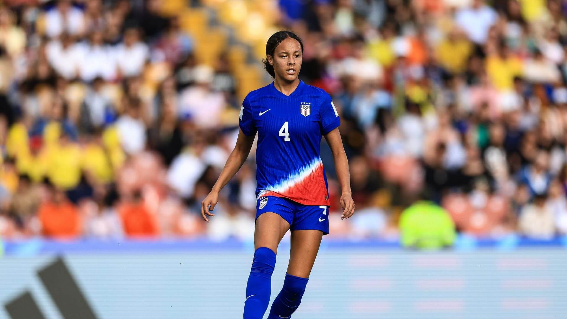
Recently, the US has been experimenting with shapes in their kit designs. This year, after their blobular designs of 2020, their kits are much more dynamic—the lines streak across in haphazard ways. Like Japan, the back of these kits gives way to a plain blue, but only for about ¾. It’s an interesting design that isn’t overpowering or messy.
Canada
This all-red jersey got massive points for being more than what it appears at first glance. However, the closer you look, the more you realize this isn’t a simple red jersey. Instead, it’s shades of red and finely detailed. When looked at in detail, this shiny red jersey is actually decorated with maple leaves, like the Canadian flag.
Netherlands
The Netherlands kit combines all of the elements for a top-tier design. They are sporting their classic orange—much like Brazil and Sweden’s yellow—but in a completely interesting way. Like Canada, the Netherlands jersey has lines running all through it at different angles. When you look at first, you might think they’re just chaotic designs. However, if you look close, you can see the face of a lion. This is the coolest design of all Olympic kits, no matter how the others fall in place.
Think we got something wrong? Let us know in the comments!
Featured Image via @oranjevrouwen on Twitter


